
The Engineers Australia logo is instantly recognisable, making it our strongest brand carrier and acts a shorthand for the authority of our organisation. Our logo is available in three colourways for flexibility and maximum branded impact: primary, reversed and mono. Learn more about how to use each colourway below.
Our logo must never be altered, coloured or combined with any other names or elements. The portrait oriented logo should be used as default. The symbol can be used in isolation for select instances, like in our social media profile images.
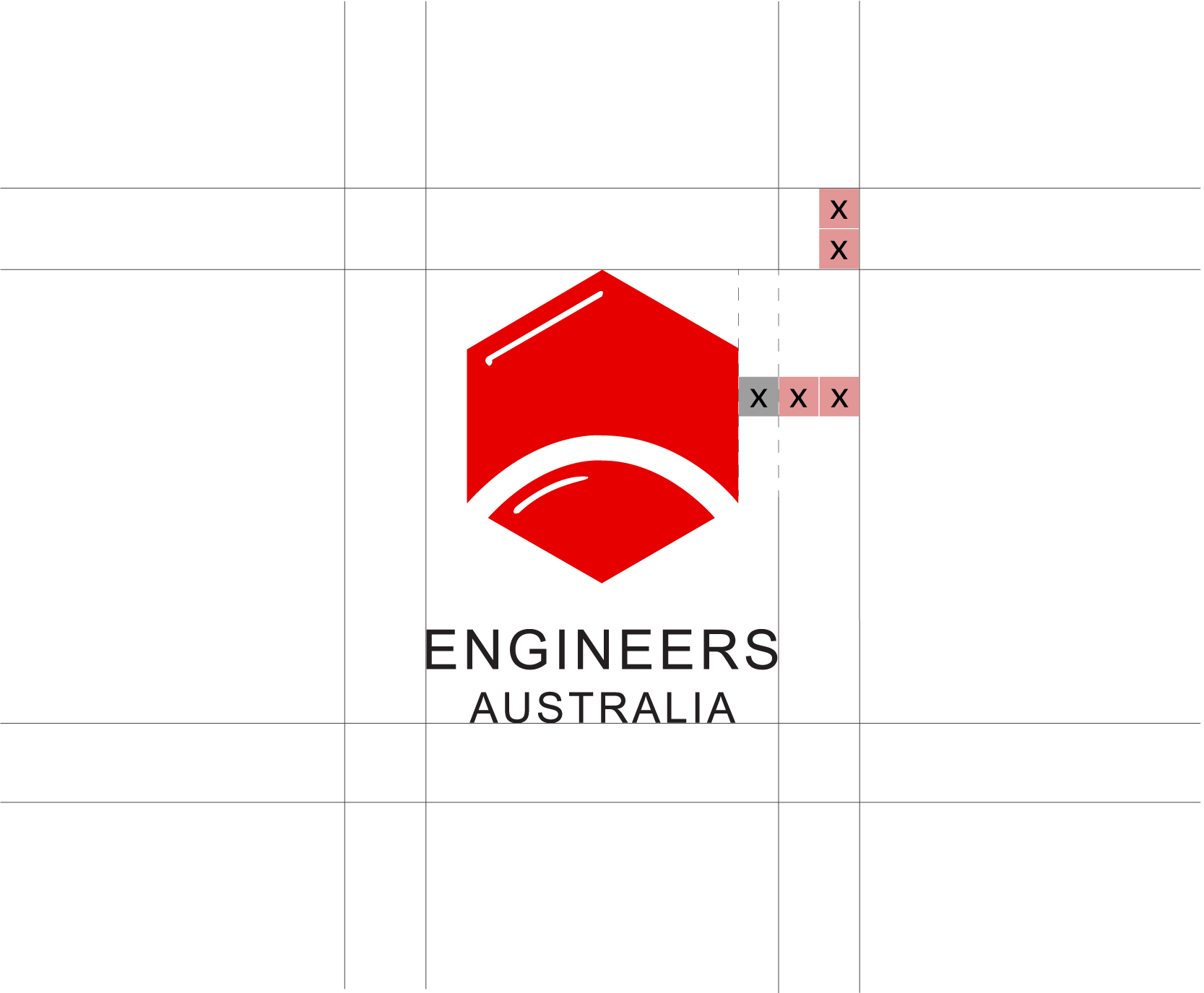
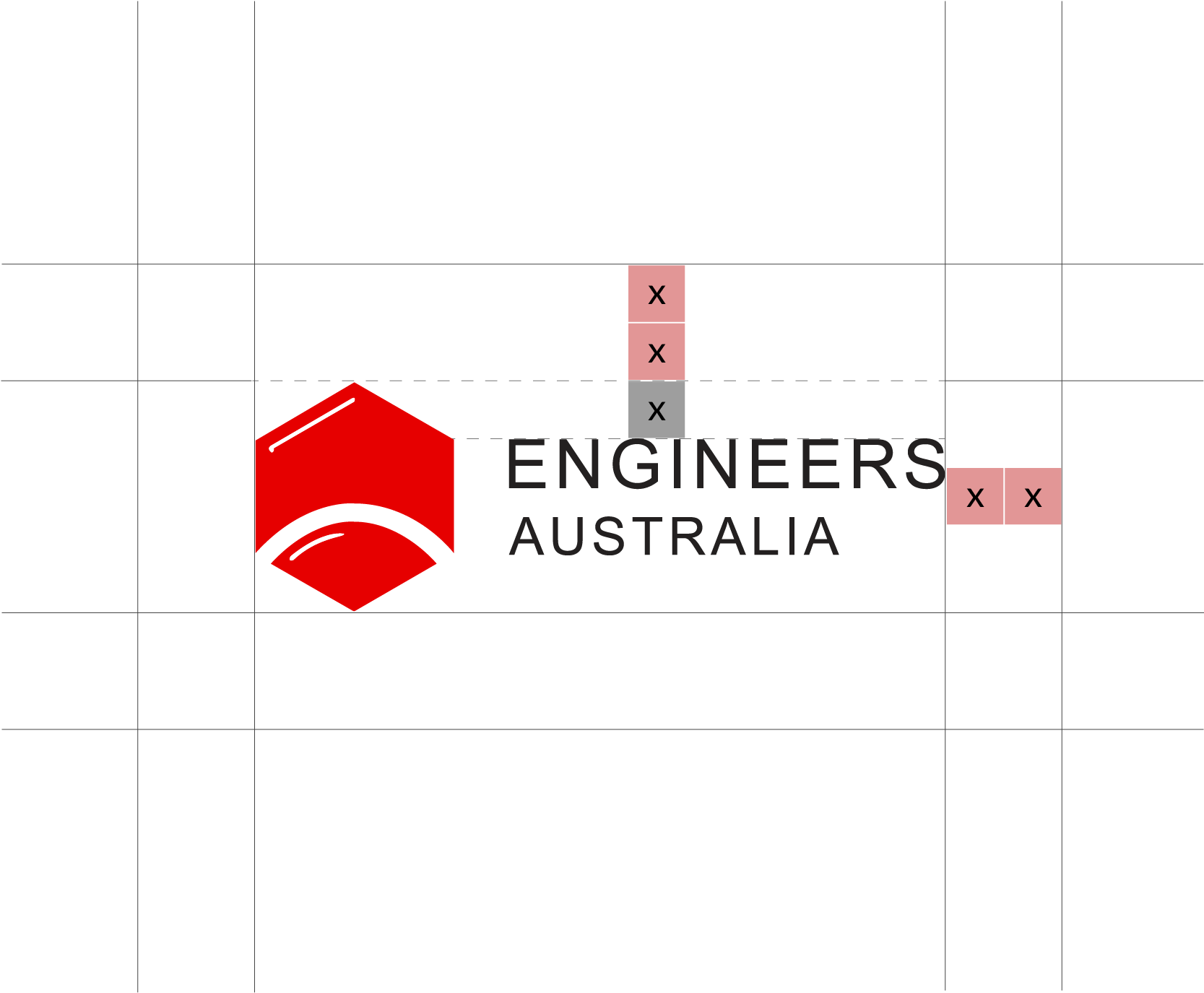
Maintain clearspace around the logo at all times. Clearspace is based on logo proportions and is shown as pink boxes in examples below.
Minimum size: 25mm (print), 75px (digital)
When creating a logo lockup for Engineers Australia technical societies and related conferences, a thin black vertical stroke should be used to separate the logo and text. All branded properties must be fully or co-branded with this logo.
No entity can use its own logo that includes or distorts the core Engineers Australia logo.
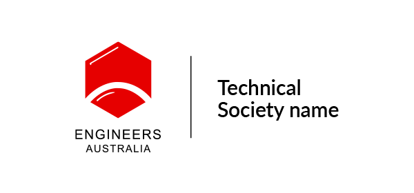
As the trusted voice of the profession, the Engineers Australia logo can be used to endorse member-led groups. These specialised groups include student societies, communities of practice, special interest groups and international chapters. Our logo should always be placed on the left-hand side of the lockup, clearly signifying we are the endorsing brand.
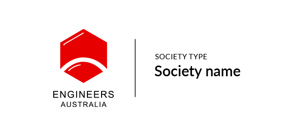
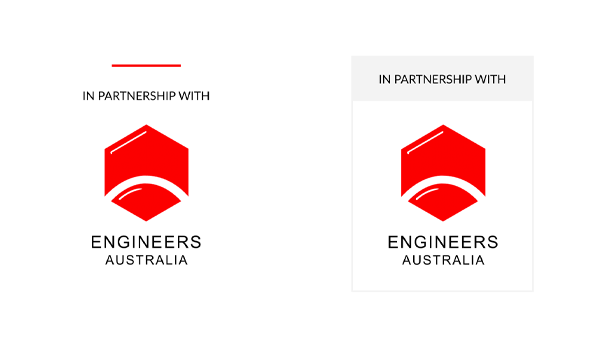
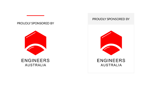
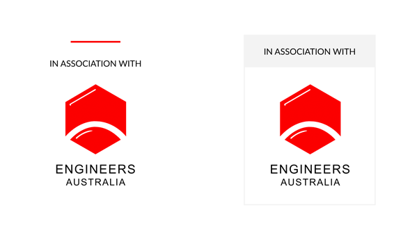
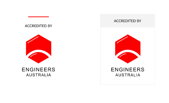
Support lockups position Engineers Australia as the peak industry body and show our involvement. Use them consistently to maintain brand authority. Available in two versions: framed and unframed.
Use the logo consistently and without modification.
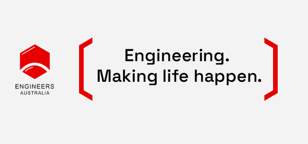
YES: Apply approved logo files exactly as provided.
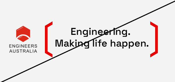
NO: Alter proportions, colours, or elements
Select the correct colourway for context.
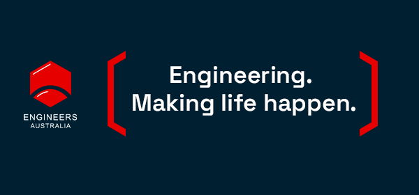
YES: Use primary on light backgrounds, reversed on dark, mono when required.
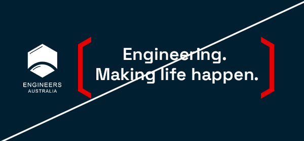
NO: Use incorrect colourways against unsuitable backgrounds.
Maintain logo integrity through spacing and size.
YES: Apply minimum clearspace and size requirements.
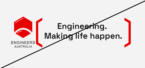
NO: Crowd the logo or reduce below legible size.
Use the correct logo format for the layout.
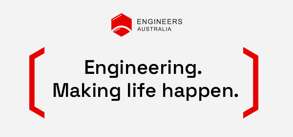
YES: Use secondary (horizontal) only when space is constrained.
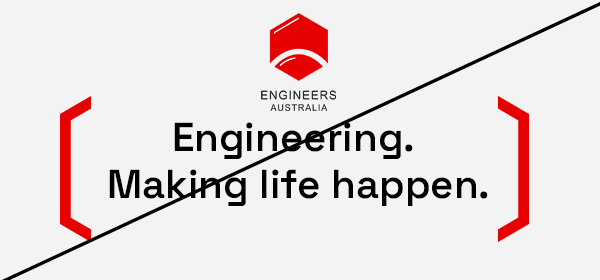
NO: Using the primary logo when space is constrained.